This is the second post in a series I’m writing on Azure’s Application Insights (AI) service. In the previous post we looked at how to instrument our application code for monitoring.
Here in this post we will walk through how to create application monitoring dashboards directly in Azure using the Azure Dashboards feature and leveraging data from Application Insights and Azure resource metrics.
Series links
Part 1: Azure Application Insights series part 1: How to instrument your application code for monitoring.
Part 3: Azure Application Insights series part 3: How to configure monitoring alerts.
Azure dashboards
Azure allows you to create custom monitoring dashboards with ease thanks to the Azure Dashboards feature. That reference link shows in detail how to create a dashboard, add/edit dashboard tiles using their WYSIWYG editor, and sharing/publishing your dashboard. I won’t cover most of those basics since they are already represented well in the above link.
We will however cover some examples for creating charts to show built-in metrics (SLIs) for Azure resources and making charts for custom instrumentation.
Tip: I recommend designing the initial dashboard view/layout with the WYSIWYG editor in the Azure portal, then following the instructions here to convert the Dashboard’s exported contents into an Azure Resource Manager (ARM) template for deployment in your infrastructure-as-code deployment pipeline.
Chart example: built-in metrics
As I mentioned in the first post in the series, many of the common service level indicators (SLIs) for Azure services are already baked in. For demonstration purposes let’s create a chart off of one of those built-in metrics for an Azure Web App: HTTP requests.
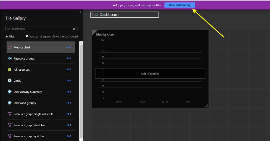
1. Create a new (or edit existing) Dashboard in the Azure Portal.
2. Add a Metrics chart control from the list of available tiles in the Tile Gallery.

3. Move/resize the metrics tile chart as you wish, then click Done customizing.
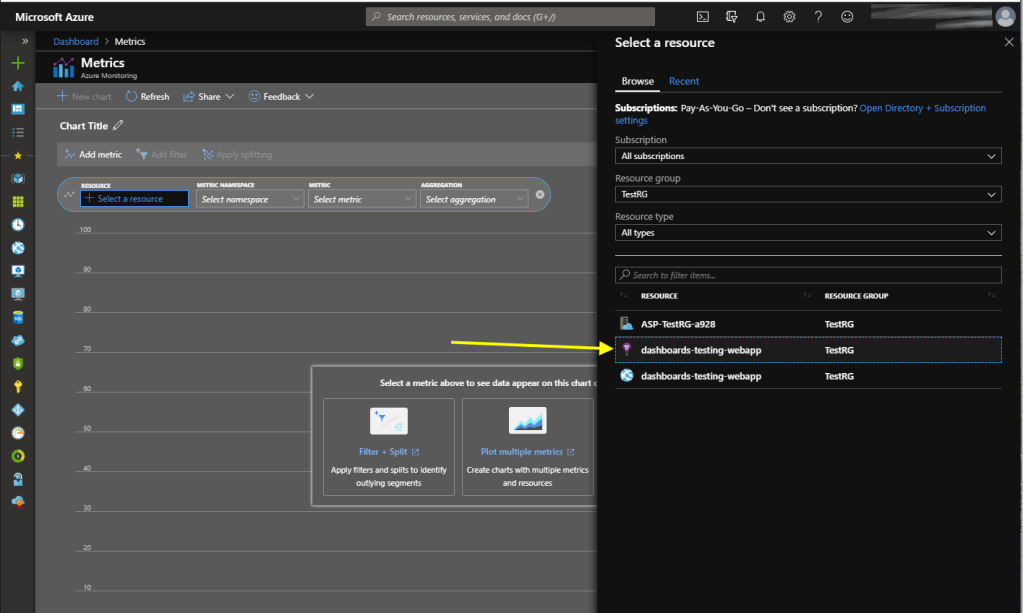
4. Once returning to the main dashboard view, we can click on Edit in Metrics in the middle of the dashboard tile to connect this chart control to some data.

5. In the Metrics window, click on “+ Select a resource“. Since we want to add a chart for a metric on an Azure resource, we find and select that Azure resource directly from this menu (instead of selecting the Application Insights instance where our custom instrumentation events end up).

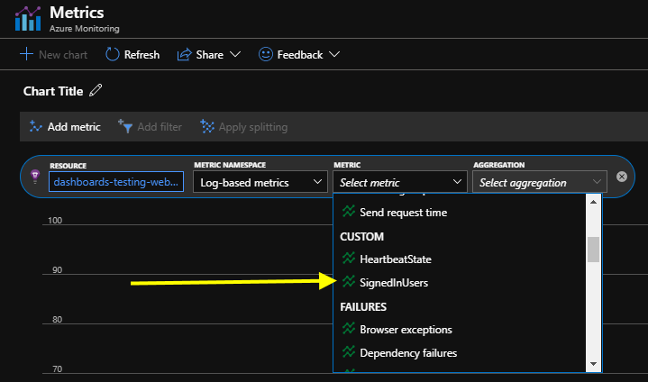
6. After selecting a resource, select the metric. For our example chart we can drill down and find Requests. This is where we can see all of the built-in metric SLI’s available to monitor on the resource.

7. After selecting a metric namespace, we can select an aggregation type. Average aggregation is fine for this chart.
8. Click on the Save to Dashboard button. Then we should see the chart data on the dashboard now:
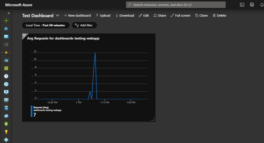
Chart example: custom instrumented metrics
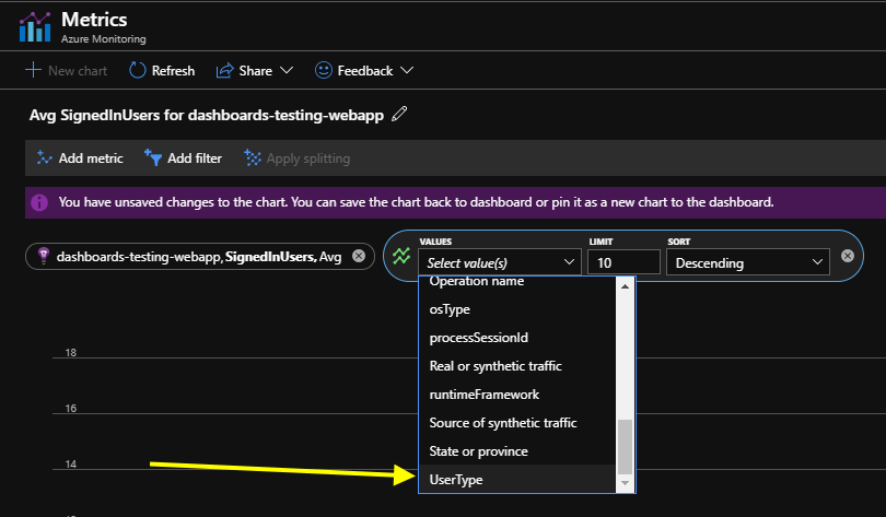
Scenario: You have added custom metrics for your Azure Web App by instrumenting your application code to log those metrics to Application Insights. For demo purposes, assume we now log a new metric called SignedInUsers, with a second dimension added (a custom property called UserType).
// logging this metric from application code
var aiClient = new TelemetryClient();

var signedInUsers = aiClient.GetMetric("SignedInUsers", "UserType");

signedInUsers.TrackValue(1, "PowerUsers");
signedInUsers.TrackValue(27, "StandardUsers");
The setup for this scenario is nearly identical to the steps for built-in metrics, except our target resource is the Azure Application Insights instance where we log the metrics (instead of the Azure Web App resource).
1. Start by editing your Dashboard object in the Azure portal, and adding a new Metrics chart tile.
2. When selecting the target resource for the metrics, specify your Application Insights resource where the custom metric telemetry is being logged to.
3. Your custom metrics should end up in the Custom group under the standard Log-based metrics namespace.
4. Since this metric has multiple dimensions, we can click the Apply splitting button to graph multiple lines.
5. After saving the chart to the dashboard, we now have something that looks like the screenshot below, assuming some metric telemetry was actually logged:

Chart example: custom instrumented events
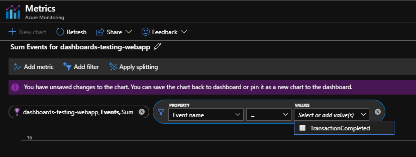
Scenario: You have added custom events for your Azure Web App by instrumenting your application code to log those events to Application Insights. For demo purposes, assume we now log a new event called TransactionCompleted, with a second dimension added (a custom property called TransactionType).
// logging this event from application code
var aiClient = new TelemetryClient();

var eventCustomProperties = new Dictionary<string, string>() { { "TransactionType", "Sale" } };

aiClient.TrackEvent("TransactionCompleted", eventCustomProperties);
This example is similar to the example for custom metrics, in that the Application Insights resource is our target (since that is where our event telemetry is logged).
1. Start by editing your Dashboard object in the Azure portal, and adding a new Metrics chart tile.
2. When selecting the target resource for the metrics, specify your Application Insights resource where the custom event telemetry is being logged to.
3. Start by adding a metric source of Events, under the Log-based metrics namespace.

4. At the moment our line graph shows literally all custom event telemetry. We want to add a filter this chart to show just the events from our new custom event:
5. Since our custom event has an additional custom property, we can now add splitting on that property:
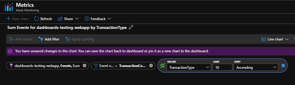
6. Final result of the custom chart looks pretty great. It shows our custom event TransactionCompleted, split into the different types of transactions based on the additional custom property.

Conclusion
This concludes the second post of the Application Insights series. Stay tuned for the next post where we look at creating monitoring alerts for the telemetry data in Application Insights.

2 thoughts on “Azure Application Insights series part 2: How to create application monitoring dashboards in Azure”